A Good Brand can’t have a secret identity.
Gifted designers at an advertising agency are known as unicorns. We’re fortunate to have these mythical beings in our midst, having just won more Graphis International Design awards–as an ad agency–than any design firm in Minnesota. Fernando, our supremely talented but self-effacing lead designer may dispute the unicorn designation, but then again, his last name is Palomino.
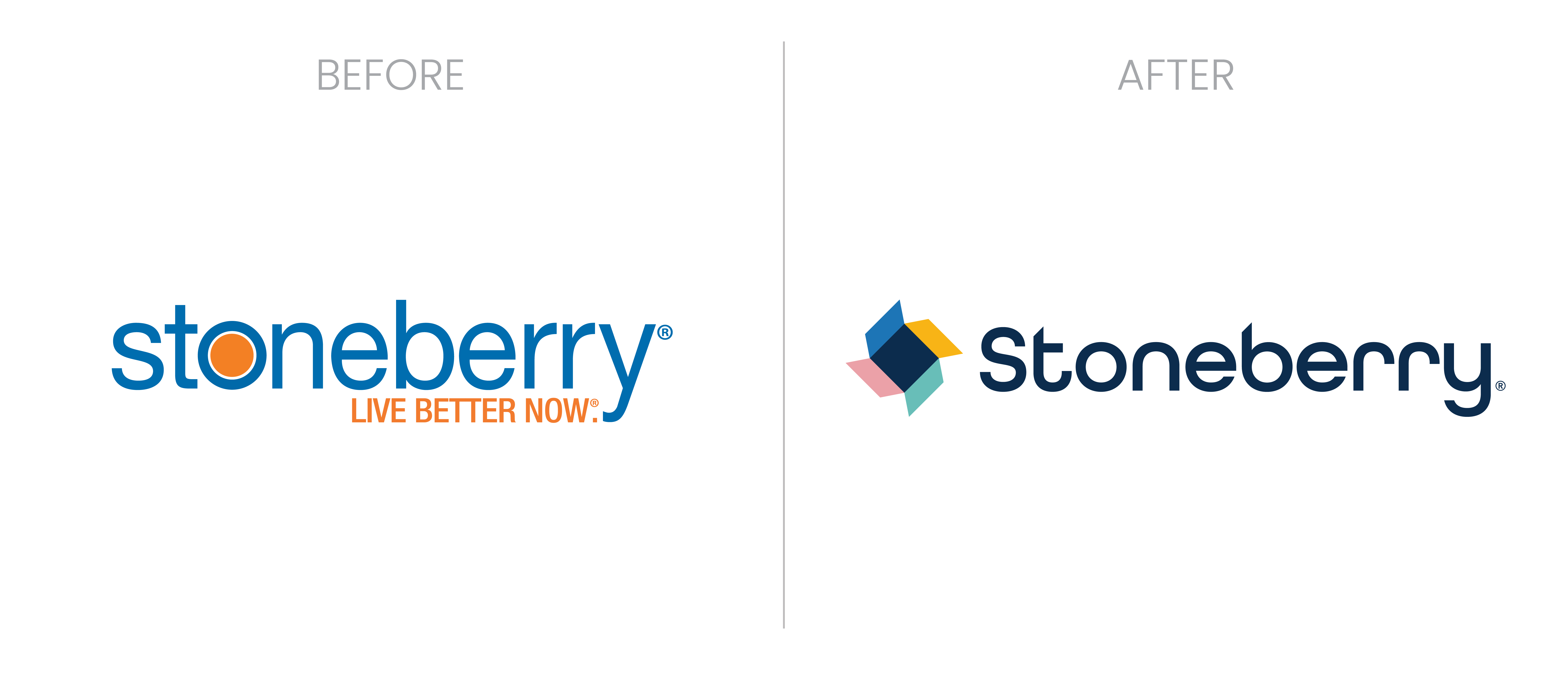
Stoneberry
Stoneberry is a family-owned online retailer for low-income, credit-challenged shoppers. With research suggesting these shoppers needed more joy in their lives, our new logo represents “opening joy” aka the flaps of a box, or the fins of a pinwheel depending on your perspective.
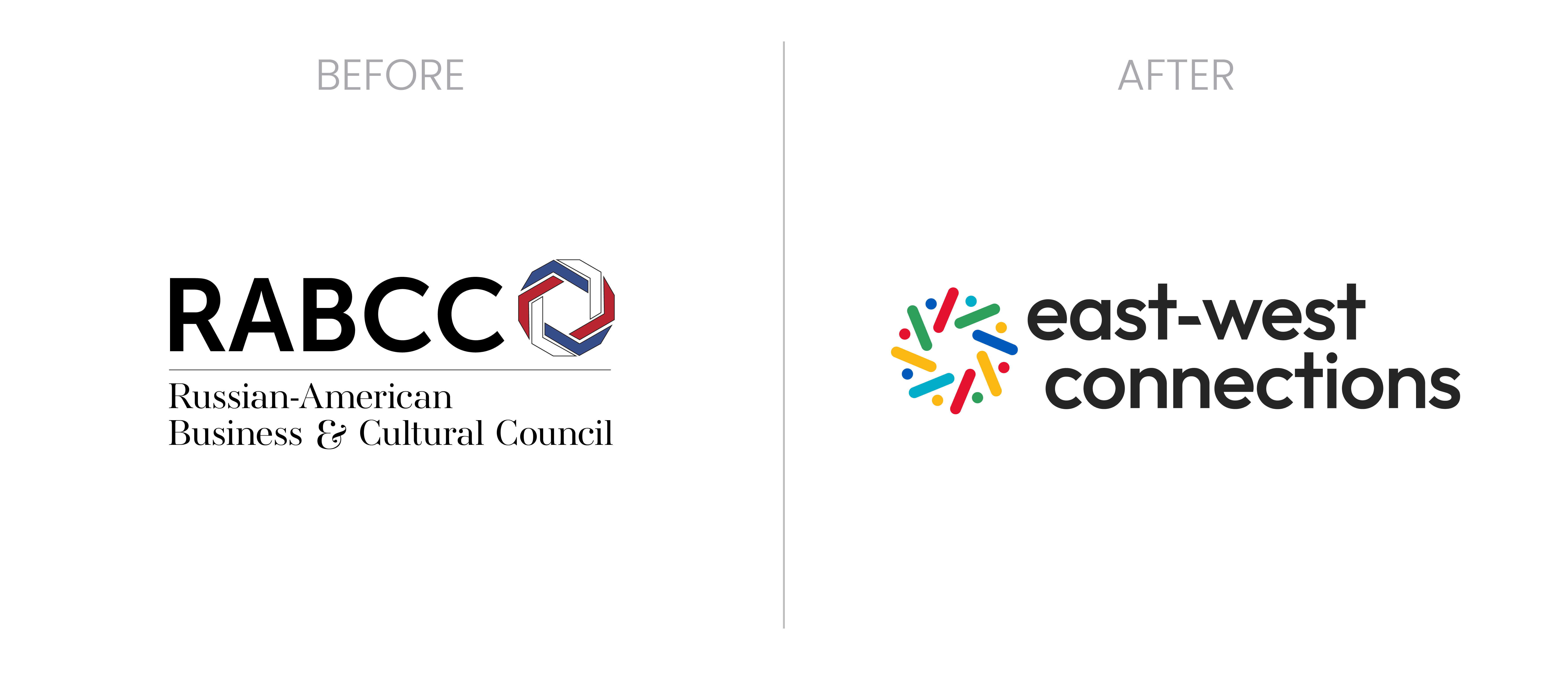
East-West Connections
East-West Connections was the urgently needed (since the war in Ukraine) new name of the Russian American Business and Culture Council.
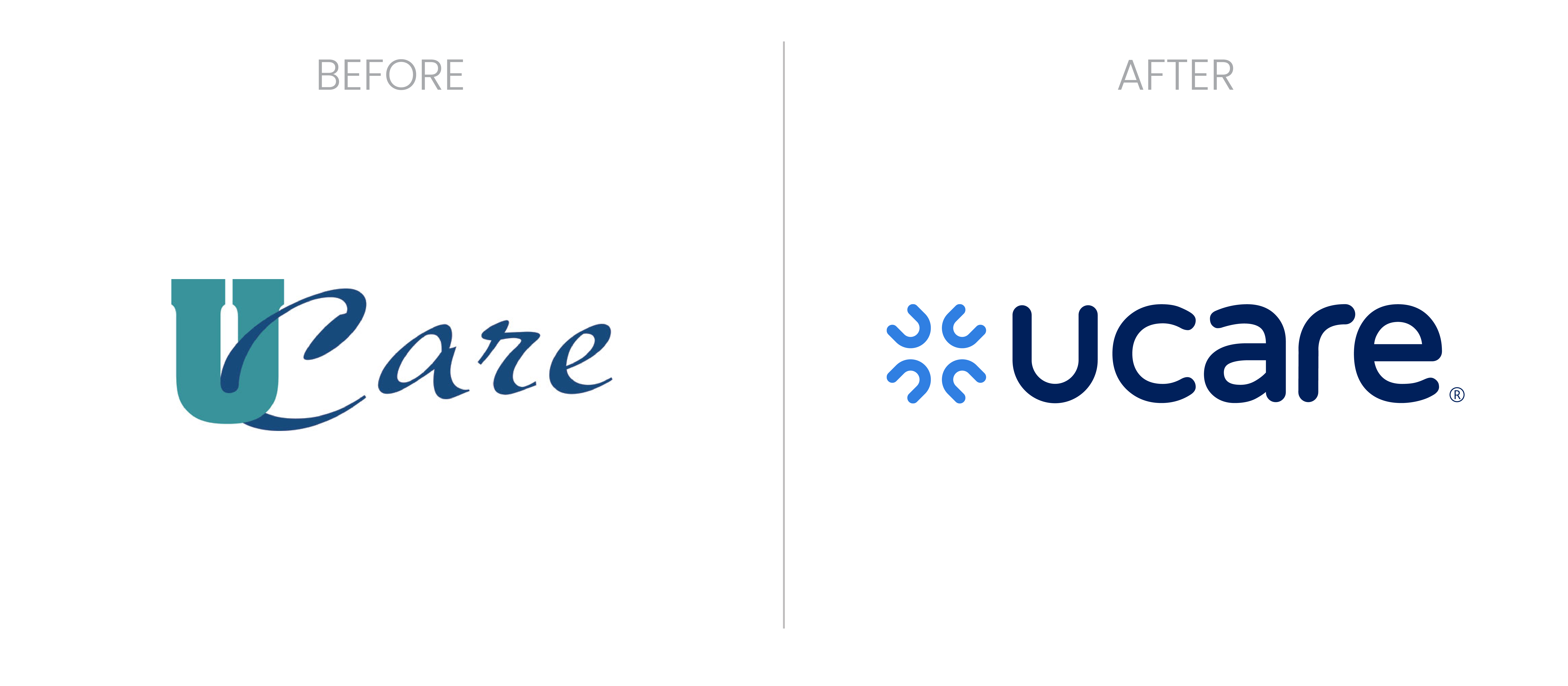
UCare
UCare’s updated logo eliminated long term confusion that it was somehow part of the University of Minnesota, and represents the unmatched teamwork of this people-powered nonprofit that provides health coverage in Minnesota and Western Wisconsin.
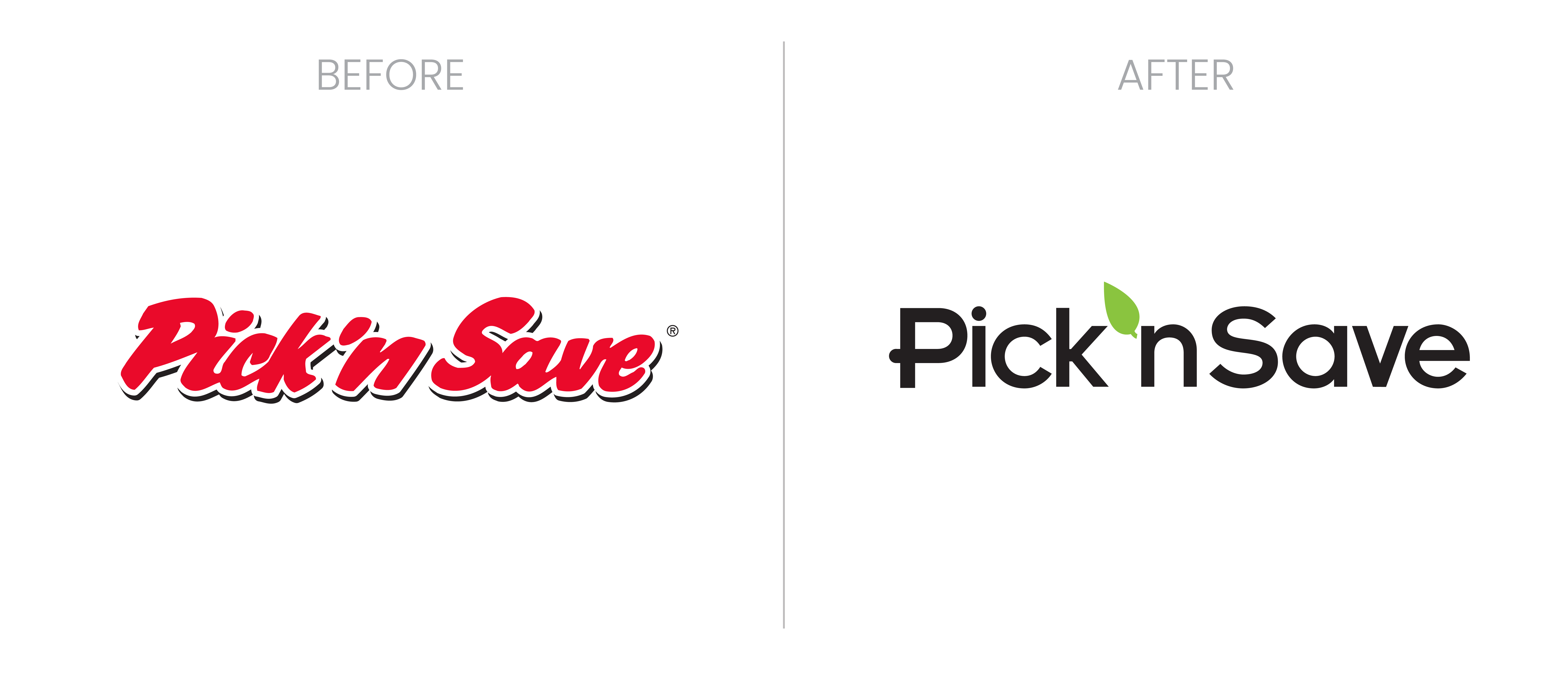
Pick’n Save
Pick’n Save couldn’t compete in the race to the bottom low, low price battle with their big box competitors, so we helped refocus their brand as the “Fresh everyday” option.
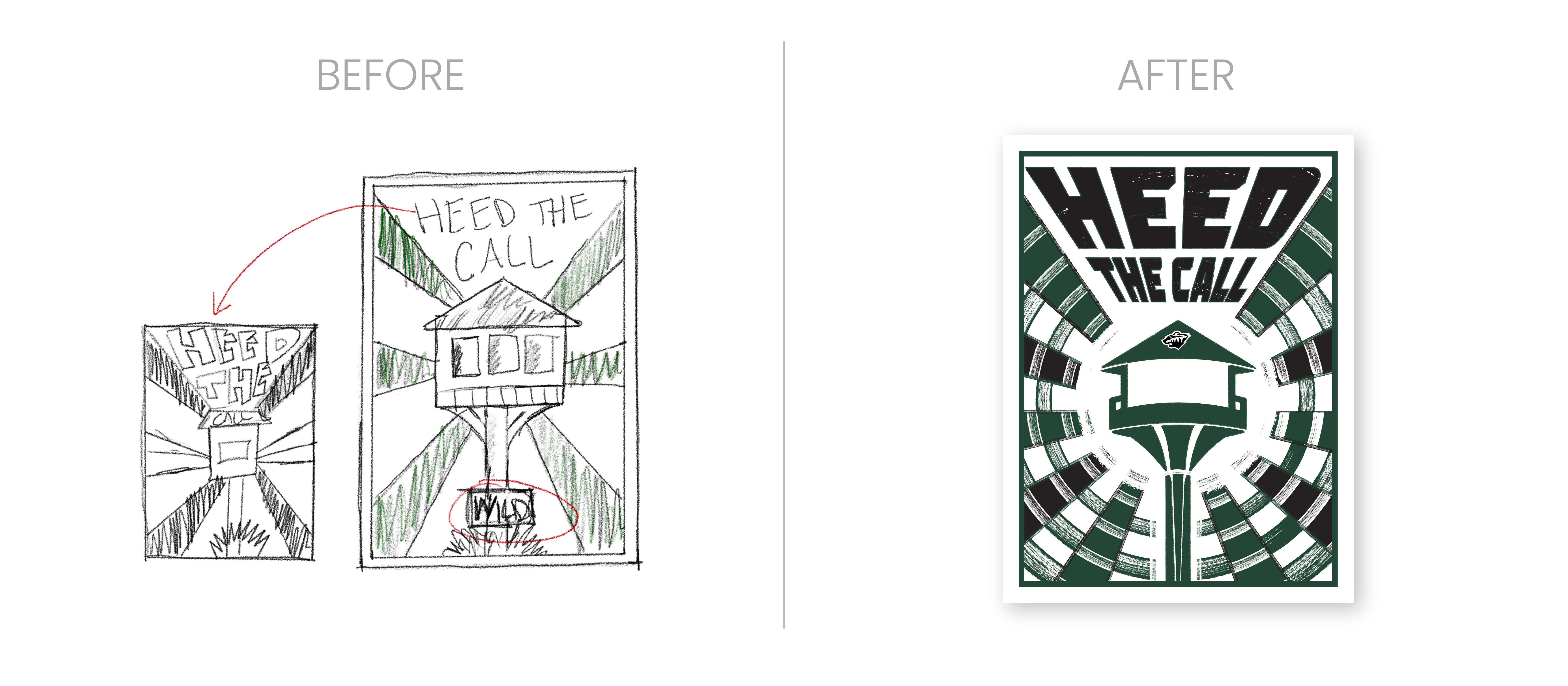
MN Wild
This Minnesota Wild poster, signed by the team captains, was a gift to new season ticket members as a display of their pride in supporting the best hockey team in the whole freakin’ world.